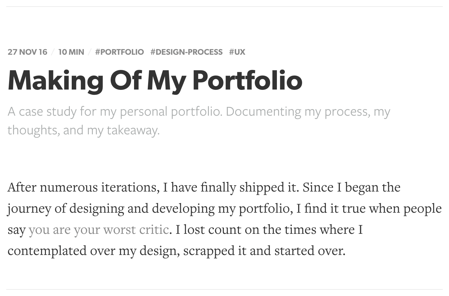
Making Of My Portfolio
A case study for my personal portfolio. Documenting my process, my thoughts, and my takeaway.
After numerous iterations, I have finally shipped it. Since I began the journey of designing and developing my portfolio, I find it true when people say you are your own worst critic. I lost count on the times where I contemplated over my design, scrapped it and started over.
Should designers have a portfolio? This got me thinking, what is the purpose of a portfolio? Surely it is more than having pretty visuals on a website or for the sake of having something online. Personally, I find that having a portfolio is having a space where I can reflect on the work that I have done. An opportunity to rethink the decisions and learn from my mistakes. Also, a platform to showcase your craft to your target audience. Some like-minded people might stumble upon your portfolio and would reach out saying they appreciate your work. Even better, a potential client or potential employer might read your work and think you are a good fit.

My Approach
Create an experience that offers a balance between visually pleasing and clarity for the users. No mumbo jumbo. Common sense instead of wow moments. Being mindful that the purpose of the portfolio is to reflect and showcase. The focus lies on the content — that is the core.
Fast-Forward
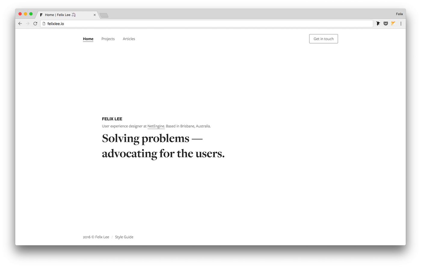
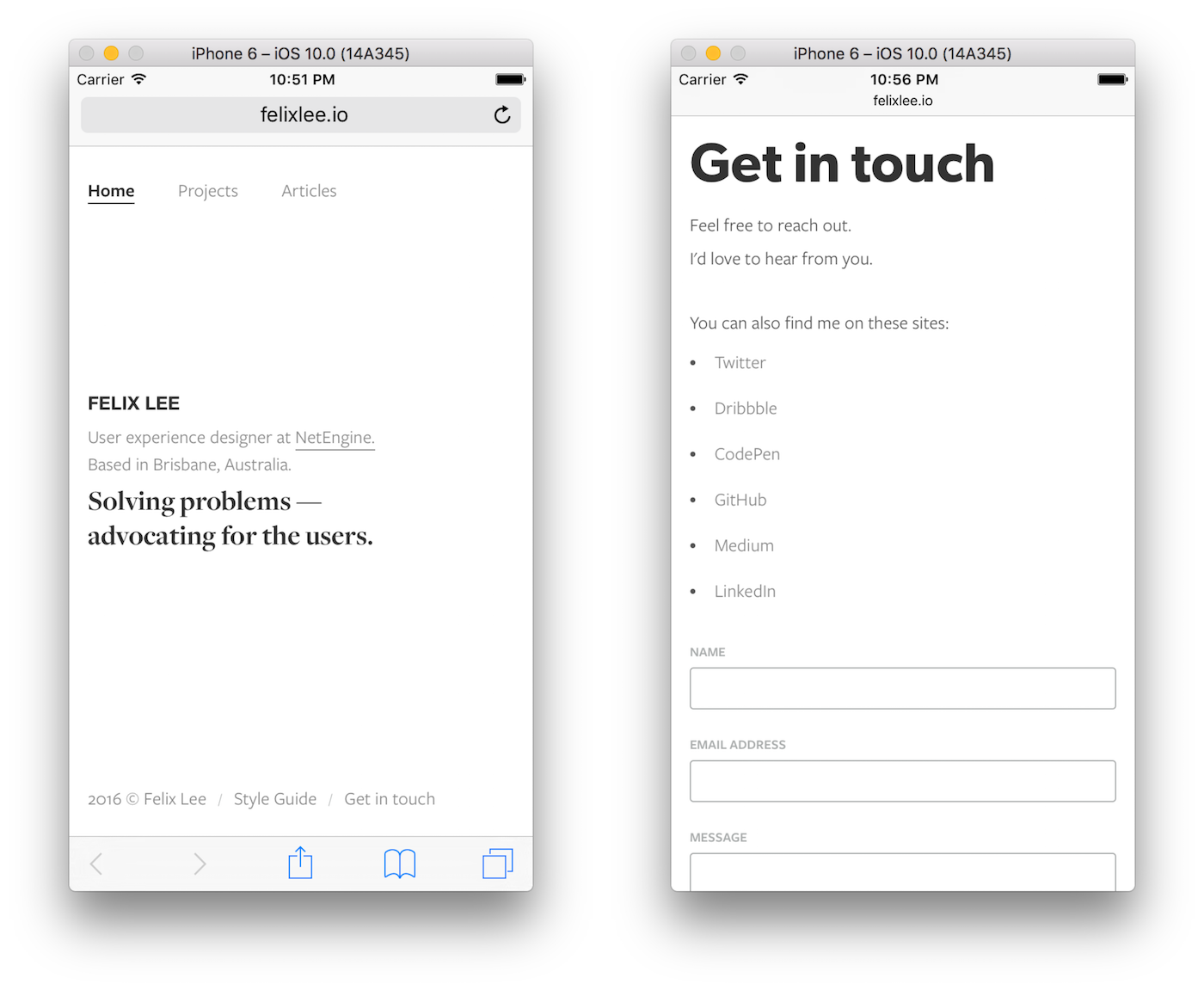
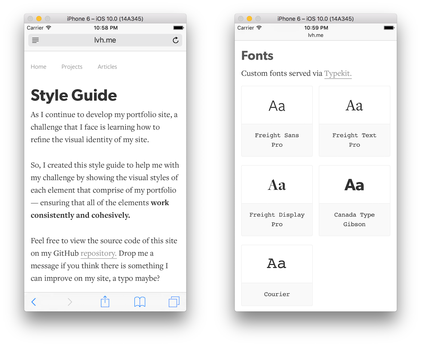
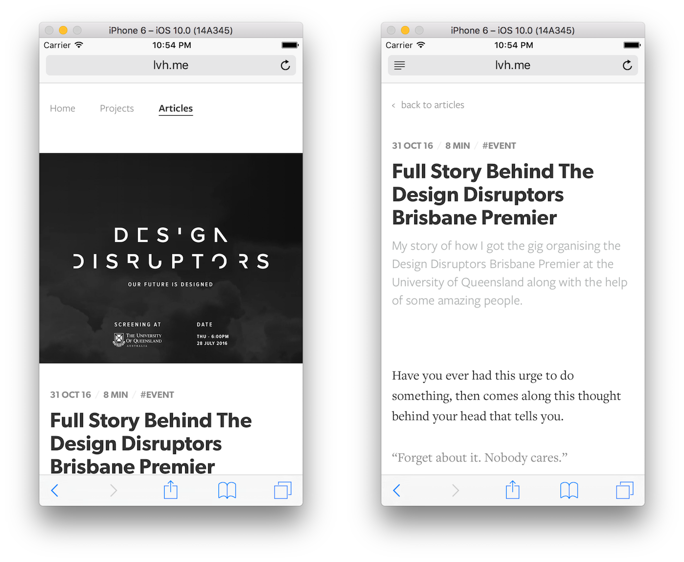
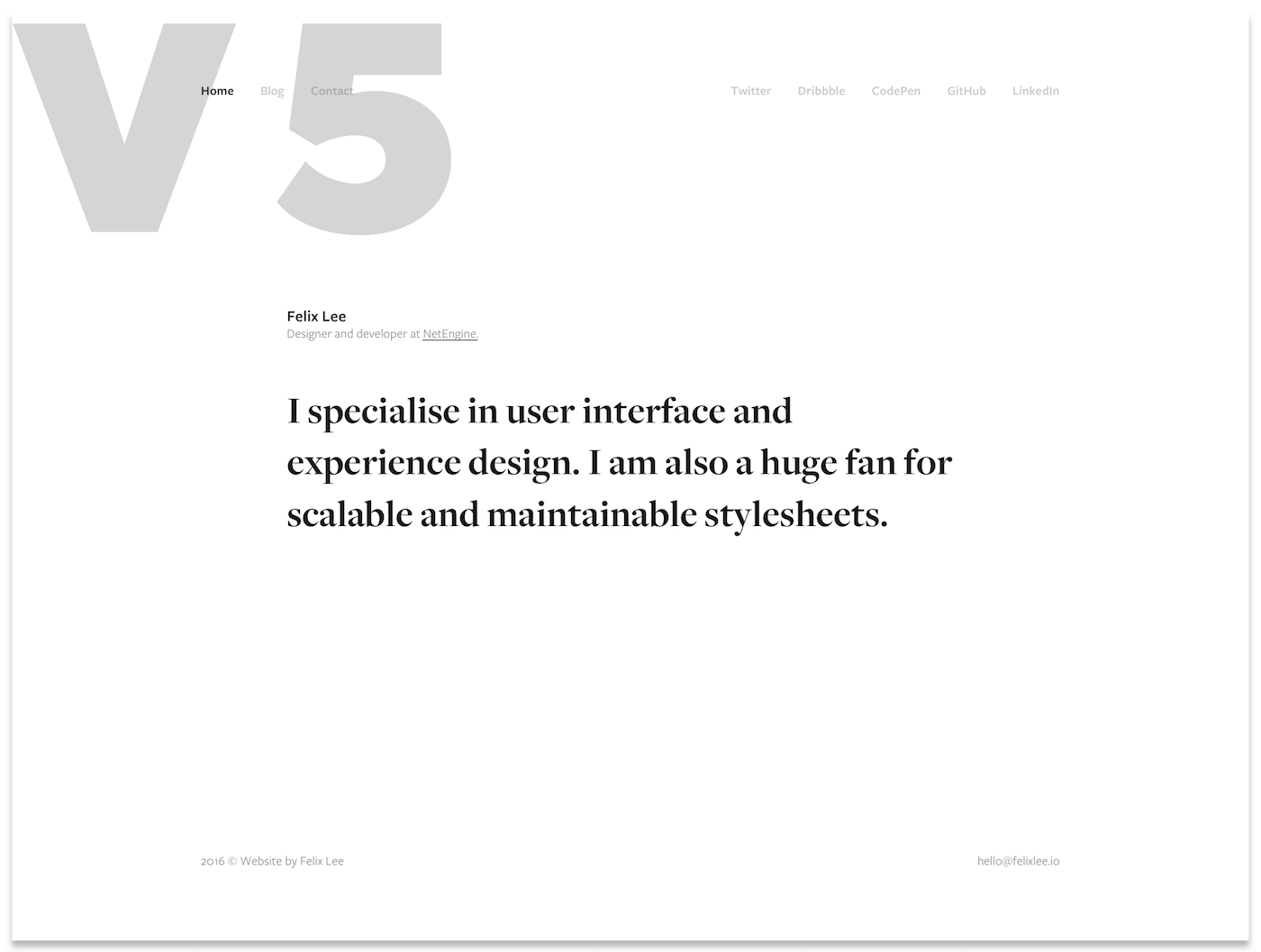
Looking back at my GitHub repository, I had my first commit on the 30 June 2016. Add in a couple weeks for my design process. Roughly 6 months has past since I started design and development of my portfolio. Finally. Here I am. Checkout the pixels below for the current version (as of 23 Nov 2016).
MacBook Pro 13-inch (2560 * 1600 Resolution)
Xcode Simulated (1345 * 750 Resolution)
Design Process
From here on, we go in-depth about my process. The first step is figuring out who might use it, or who I intend it to be used by — users and target audience.
Users And Target Audience
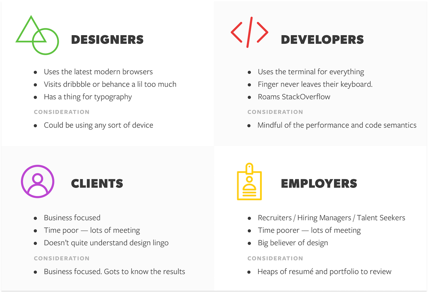
Important practice to always identify the users. Regardless of any product or service, even something small as a portfolio — the first step to begin with is best to learn about your users. This can greatly reduce the risk of building something that nobody wants. In this case, nobody enjoys. Another great practice is to regularly remind yourself that you are designing for the people who would use it.
I listed down my target audience and written up personas for each group. The purpose for this step is to understand how one group might feel while journey through my portfolio. Being aware of their personalities and behaviour, we can and should keep them in mind when designing.
Ideation and Wireframes
After figuring out my users and target audience. I began designing wireframes via Sketch. I was clear with my approach—balance between aesthetics and simplicity. For each version, I experimented the position of elements and how would the user progress through the site.
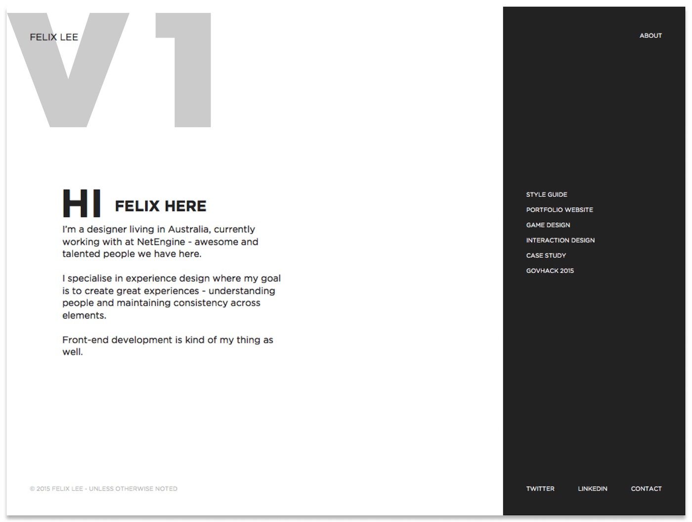
V1. Text on the left as opening — greeting, introduction, experience and expertise. Section on the right for users to navigate with a list of links to projects that I would like to showcase. BUT. What happens when I have articles that I’d like to share? Where would they sit in this section? Chucking them all in there might not be visually pleasing nor would it be clear to the users about which link is a project or an article.
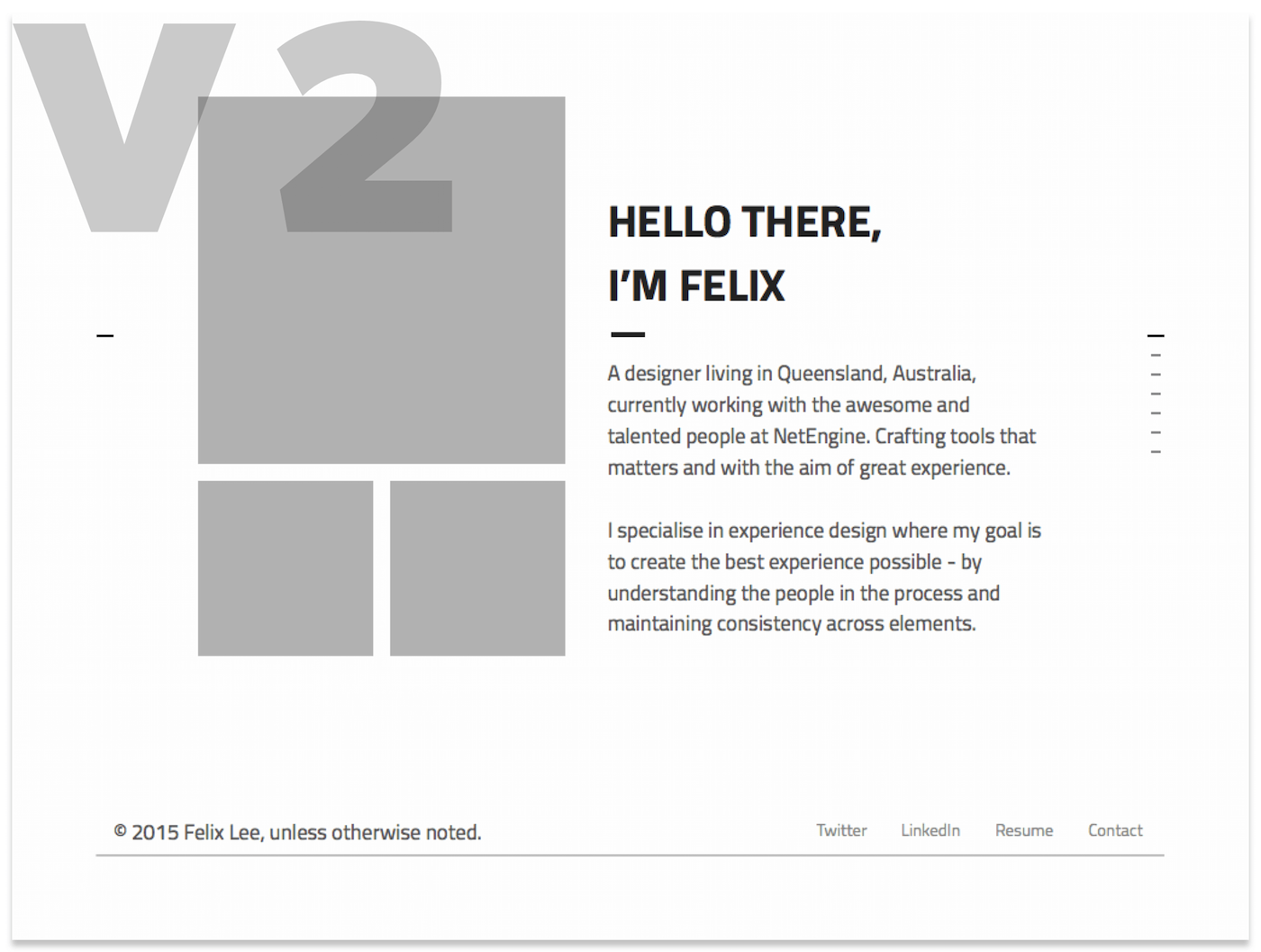
V2. Similar elements as V1. Centre text for opening. Bottom section for social profiles. But, this version utilises the pattern of full page sections with navigation indicators on the right. Each section would have the same elements — summary text and images to help illustrate the section. This design didn’t fly with me because it doesn’t provide enough clarity around what could my next content be about? Reflecting on this now, one could potentially add a next button that includes description of the next section.
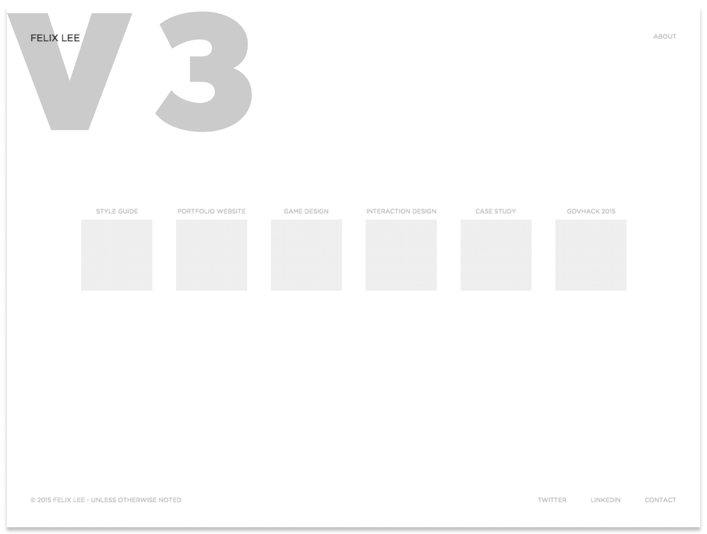
V3. Scrapping the idea of text as opening. Straight up list of projects in horizontal view — label and thumbnail for each project. Dial back on the personas, this design might be favourable to time poor users who might want to read my work as quick as possible. Down side of this design, do you know what I do by looking at it?
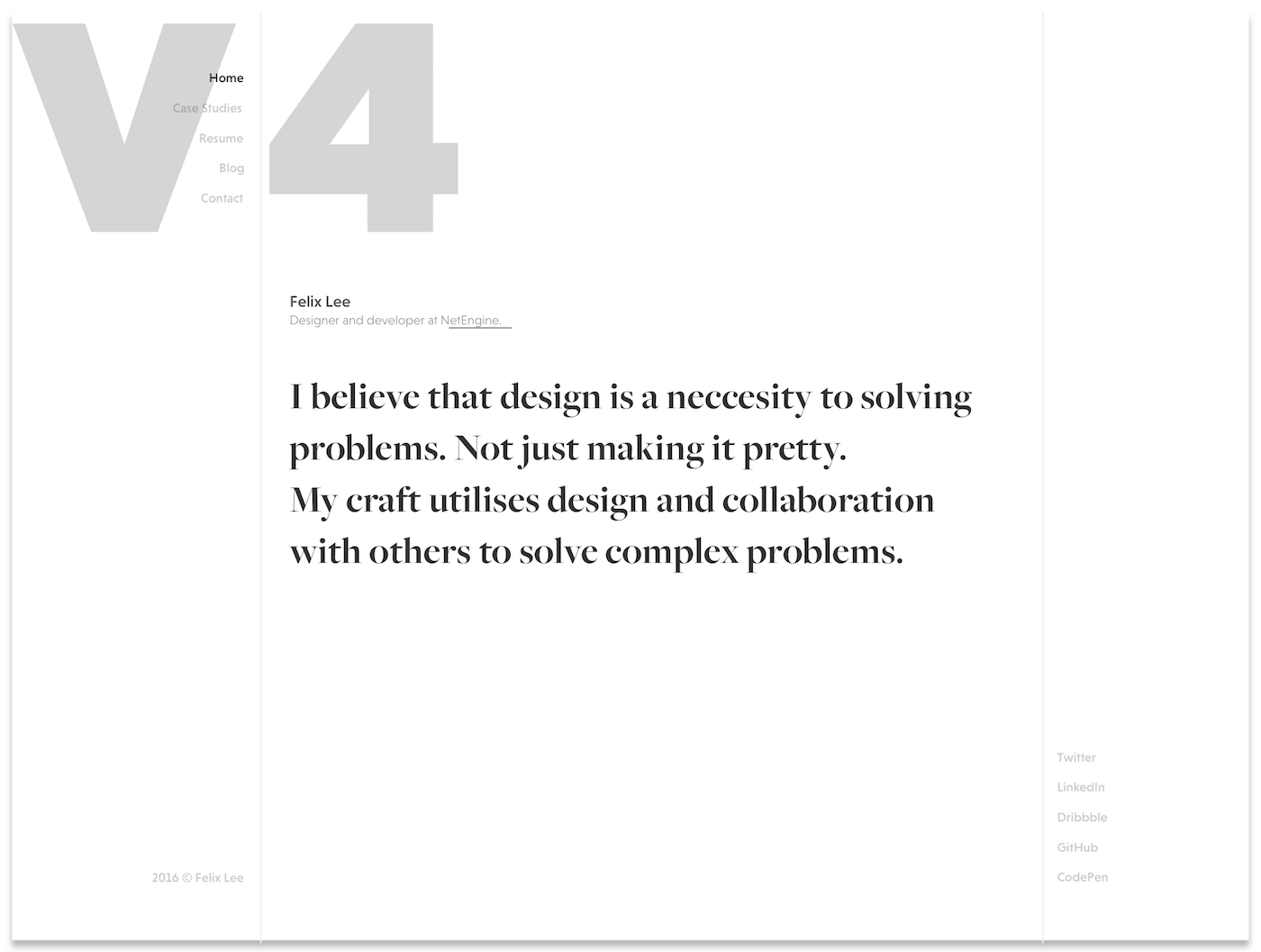
V4. Mixing it up. Vertical navigations. Centre details, and designer bio to state my personal beliefs in design. I liked this idea, because it breaks from the norm of top-and-bottom navigation. BUT. How would this work on other devices? Recall the persona where one might be using any sort of device. Think about those users.
V5. After 4 wireframes and reflecting on them. I identified a couple of patterns that paved the way for me to this design. My name, expertise and bio. Centre stage.
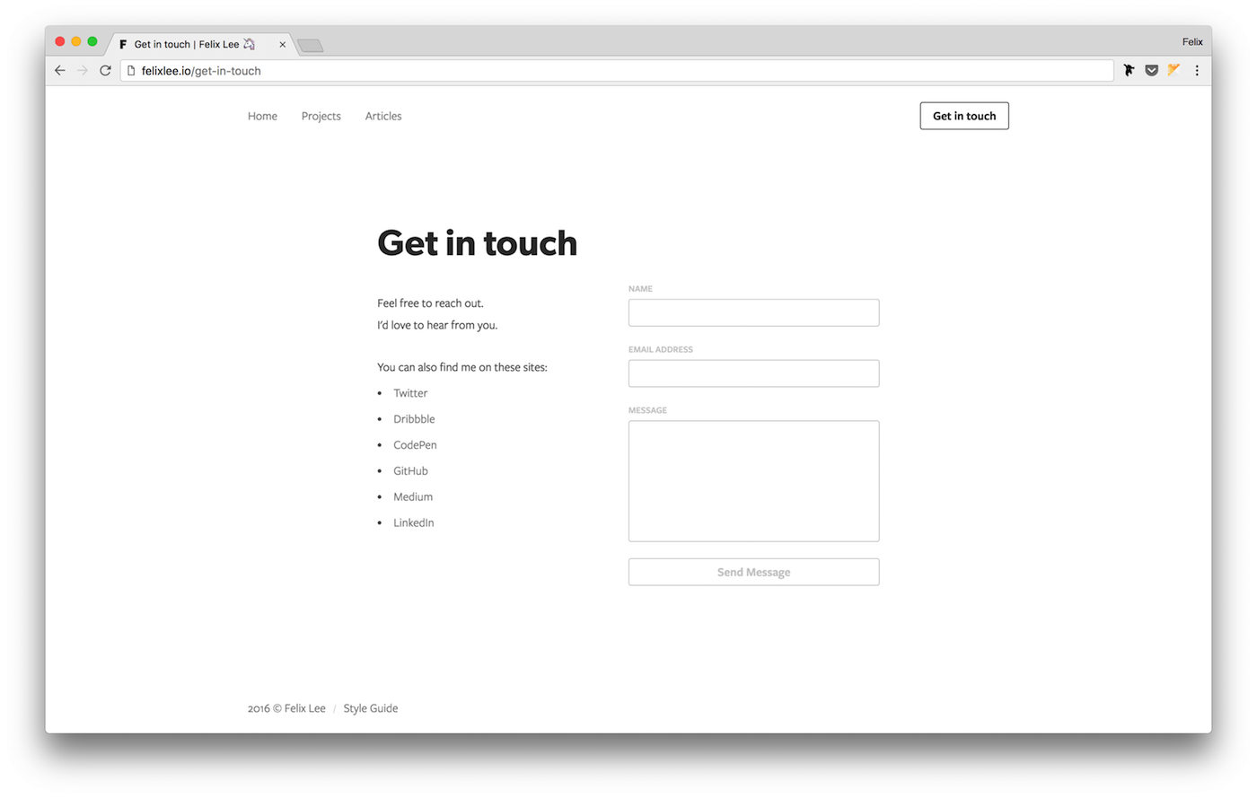
- Categorise the content. Projects and Articles as navigation items.
- Contact me link. Allowing users to reach out to me.
- Social profiles. Figured some might view my tweets or dribbble shots.
User flow
The next step to my process — understanding how users journey through my portfolio. The map below illustrates the journey of a user reaching other pages from the home page of my portfolio. The list of labels within each wrapper refers to the possible option that a user may navigate themselves.
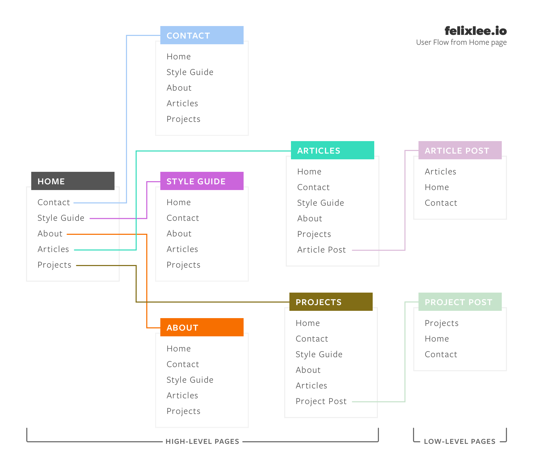
My approach with the user flow is to keep all high-level links available to the user whenever they are on a high-level page. Users can only navigate to a lower level page when users are on the parent level to it. For example, only the article page can navigate to an article post. The intention of removing high-level links on low-level pages is to reduce the chance where a user might navigate away from it. But kept the links back to parent page and home page when users decide to leave.
High-Fidelity Mockup and Prototype
Picking up from my wireframe. I made a couple changes to my design before stitching up a quick prototype. This step got me thinking about the details — colours, typography, spacing, etc. I was trying to get the tiny details right before moving on to the next step. Wrong. I wasted so much time fixating on the details when I haven’t started building anything. A reminder is needed—the purpose of this step is to test the flow.
I was trying to get the tiny details right before moving on to the next step. Wrong.
Click here to view the prototype. This prototype is aimed for larger devices, may not work on mobile devices.
Building The Thing
I am learning the ropes on web development. So I went on to build my portfolio from scratch. I find it the best way to learn is by doing it — keep practicing even if it means pulling your hair out. I built my portfolio using the static-site generator, Middleman. Hosted via GitHub Pages. I won’t go too much into detail of how I built it, but you can view my repository here.
Apart from the technology side of things. There are some considerations I’d like to go through.
Performance
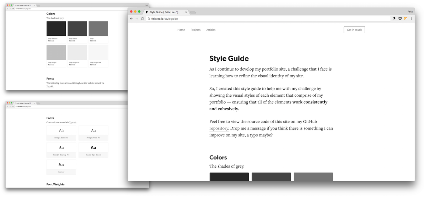
Data is expensive. I wanted to keep my portfolio site as small as possible so users won’t waste data on it. There are a couple steps that I took to keep the site small. Functional approach towards styling my portfolio is one of them. The idea of immutable classes and reusing them for everything is amazing. No more custom classes. Less lines in CSS. For more about functional and scalable CSS, read this or this.
Apart from that, I went about inlining my styles into the <head> to eliminate the need of HTTP request for my stylesheets. The tradeoff here is to have inline styles within the <head>. Ultimately, I think it is worth it.
Confirming the work. I ran a couple of network test with Chrome dev tools to check on the time required to load my home page.
- No throttling. DOMContentLoaded: average ~1.4 seconds
- No throttling. Loaded: average ~1.6 seconds
- Regular 3G. DOMContentLoaded: average ~2 seconds
- Regular 3G. Loaded: average ~2.4 seconds
- Regular 2G. DOMContentLoaded: average ~4.5 seconds
- Regular 2G. Loaded: average ~6 seconds
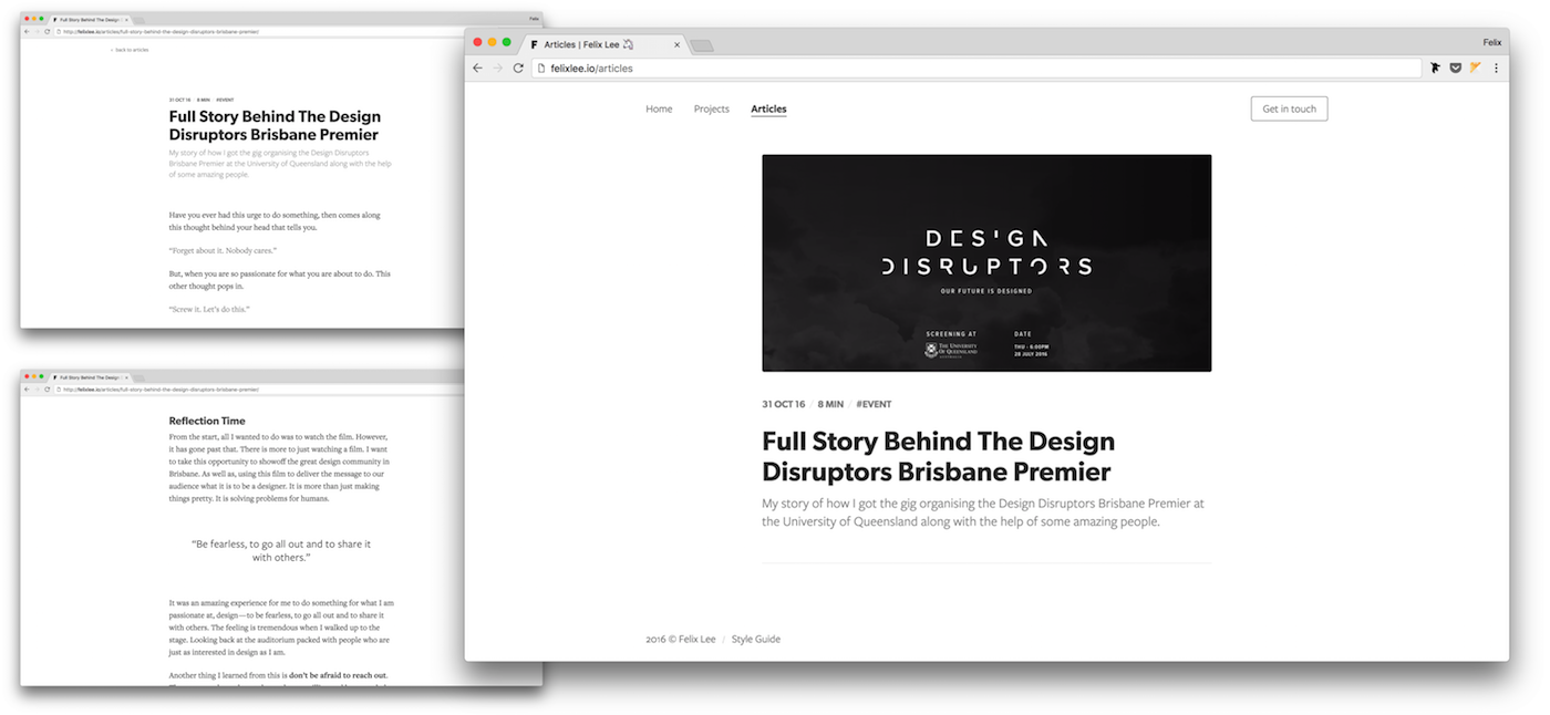
Reading Experience
I placed heavy emphasis on the reading experience since content is the core to my portfolio. It would be silly if I didn’t focus on it. The elements I have thought-out include:
- Bigger font size for both small and large screens
- Good amount of line height among sentences
- Length of sentence (14 — 18 words)
- Serif typeface for long reading
- Breathing room between paragraphs
- Legibility of typeface itself
- Font pairing to go with the serif typeface
In the end, the reading experience on my portfolio look and feels like any Medium story. It is my intention to do so. I have taken a lot of inspiration from the amazing publishing platform. I wouldn’t even deny inspecting their styles from time to time. The reason that I did it so similar to Medium is because I wanted my users to read comfortably. And, reading stories on Medium has been the best reading experience for me so far.
Accessibility
Needless to say that accessibility is an essential part to any product. It consist of a wide range of considerations that needs to designed. Ranging from responsiveness, to users who may be disabled, or using a particular device. Including bigger font sizes where users with short-sightedness can enjoy reading the content without squinting their eyes.
I ran an exercise to change my computer settings to grayscale — mimicking a case where a user might be colour blind. This lead me to realise the colour contrast of my portfolio not being suitable. Thus, I increased the contrast to comply with the WCAG AAA Compliance.
Usability
Thanks to my family and friends who have put up with me and ran the usability test for my portfolio. I managed to confirm a few tasks.
- Let’s say you find me awesome. Send me a message via my portfolio.
- Have a read on the summary of my latest writing. Can you find it?
- Click on an article. Have a quick read. Is it fine to read the article?
- Now that you’re on an article. Can you navigate back to the home page?
- Starting from the home page. Can you navigate to my dribbble profile?
Some may argue that this exercise is too much for a project this size. I would say it confirmed a fundamental part of my portfolio — usability. Plus, it validated my assumptions on some design choices.
My Takeaway
Quite an experience to have gone through each step of both design and development process. Although it went more than a weekend of work but I am glad to have built my portfolio the way I wanted for my users. Undoubtedly there are still a lot for me to learn on how to build a proper website. I would definitely do it again. For the next version, I would go for a different approach with the mood and tone. Shake things up with colours and animations. And definitely experimenting more around the reading experience.
My grand takeaway from all this — be persistent and passionate. I had obstacles along the way of this little project. Despite them being design or development obstacles, or even too much reading on how to craft a portfolio. In the end, I overcame the obstacles and reached this point. Being passionate can sometimes be overwhelming. But, the outcome of being passionate is pushing boundaries and learning new things. Without the passion for design, I wouldn’t have cared enough to have built my portfolio from scratch nor built it the way I wanted for my users. Now that I did, I feel awesome to have done it.
For those starting out to build their portfolio, I wish you all the best of luck!
Thank you for reading.
Find this story interesting? I would love to hear about it.
Feel free to tweet at me, send me an email, or flick me a message via my portfolio. Anyway you like it. I’d love to hear from you.